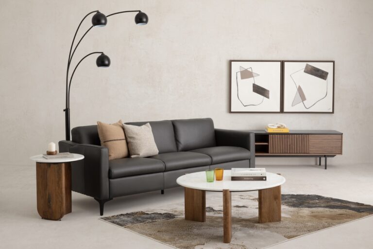
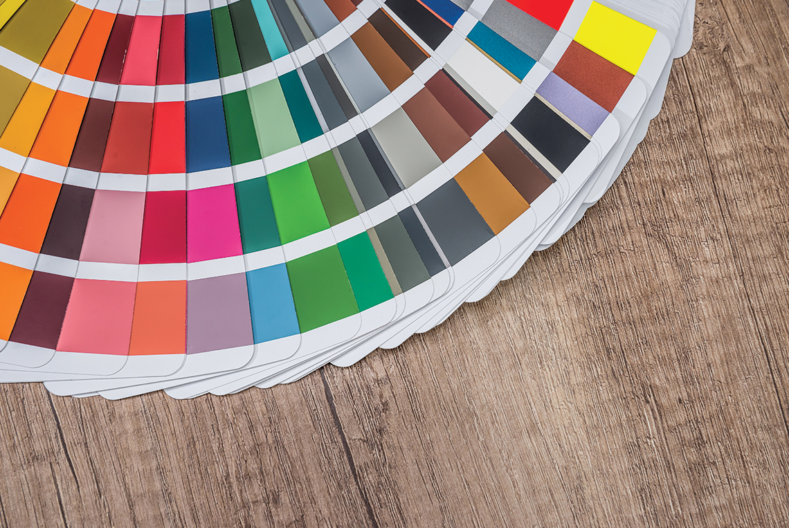
In the ever changing world of design and modern furniture, inspiration comes from many places. The Salon Del Mobile in Milan and Maison & Objets in Paris are two excellent sources. In the realm of colour, the Pantone Color Institute is the world’s authority, and nearly 10 million designers, interior decorators, architects and retailers follow its lead.
Every year in December, these creative professionals await the announcement of Pantone’s Color of the Year. The much anticipated reveal sparks a great deal of speculation and conversation.
Let’s take a quick look at the Pantone Color Institute’s superstar colours over the last five years, including the recently revealed colour of the year for 2020!
2015: Marsalais
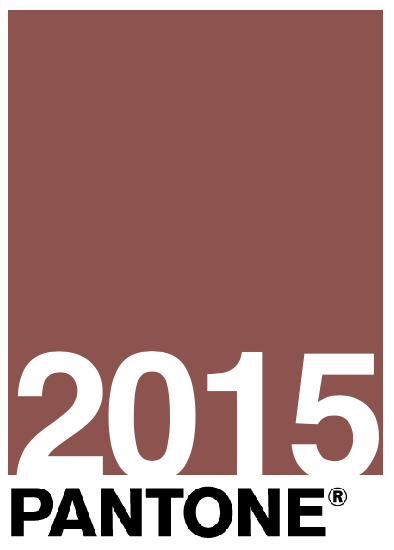
An interesting choice when it was selected as colour of the year, Marsalais is still in style, especially with the revival of the colours of the 1970s. Described as a “subtly seductive” shade, it’s all the rage in living rooms and dining rooms.
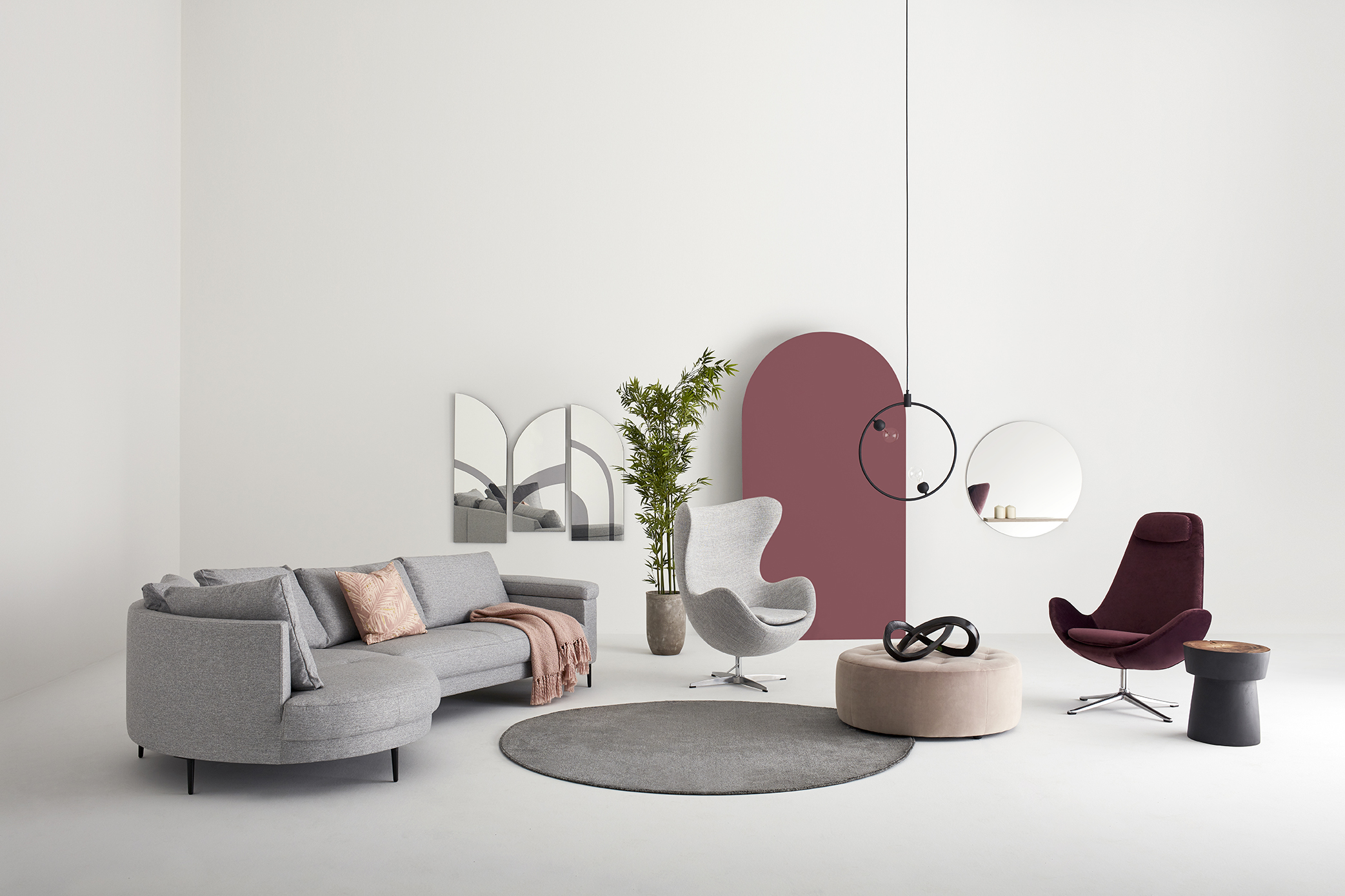
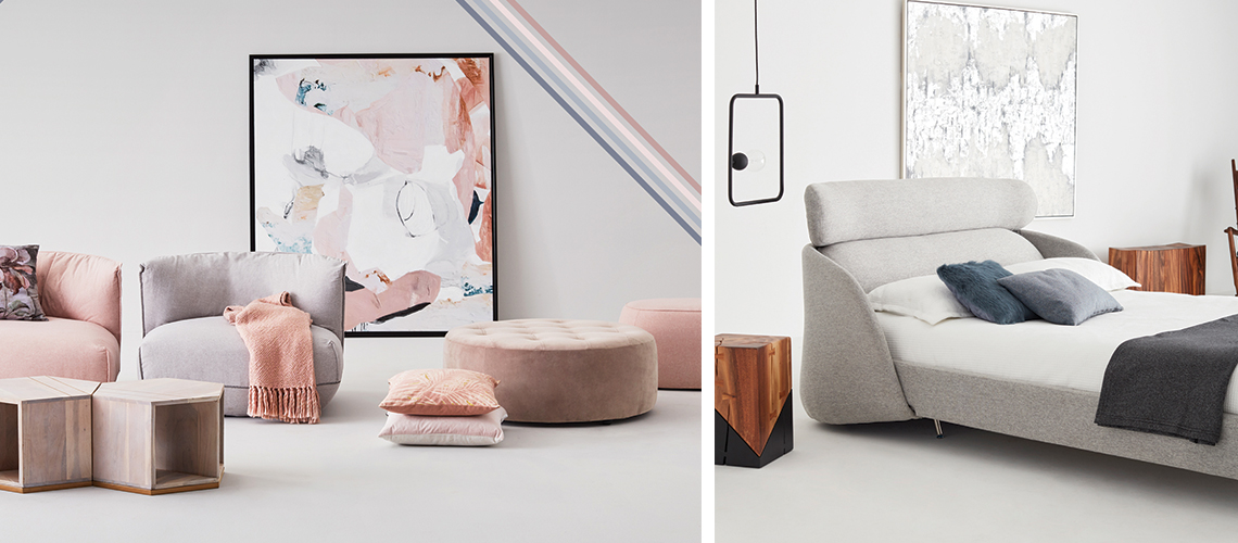
2016: Rose Quartz and Blue Serenity

The Rose Quartz and blue Serenity colour duo is still omnipresent in interior decor, decorative objects and fashion. These soothing shades are the defining colours of Scandinavian design and cosy décors.
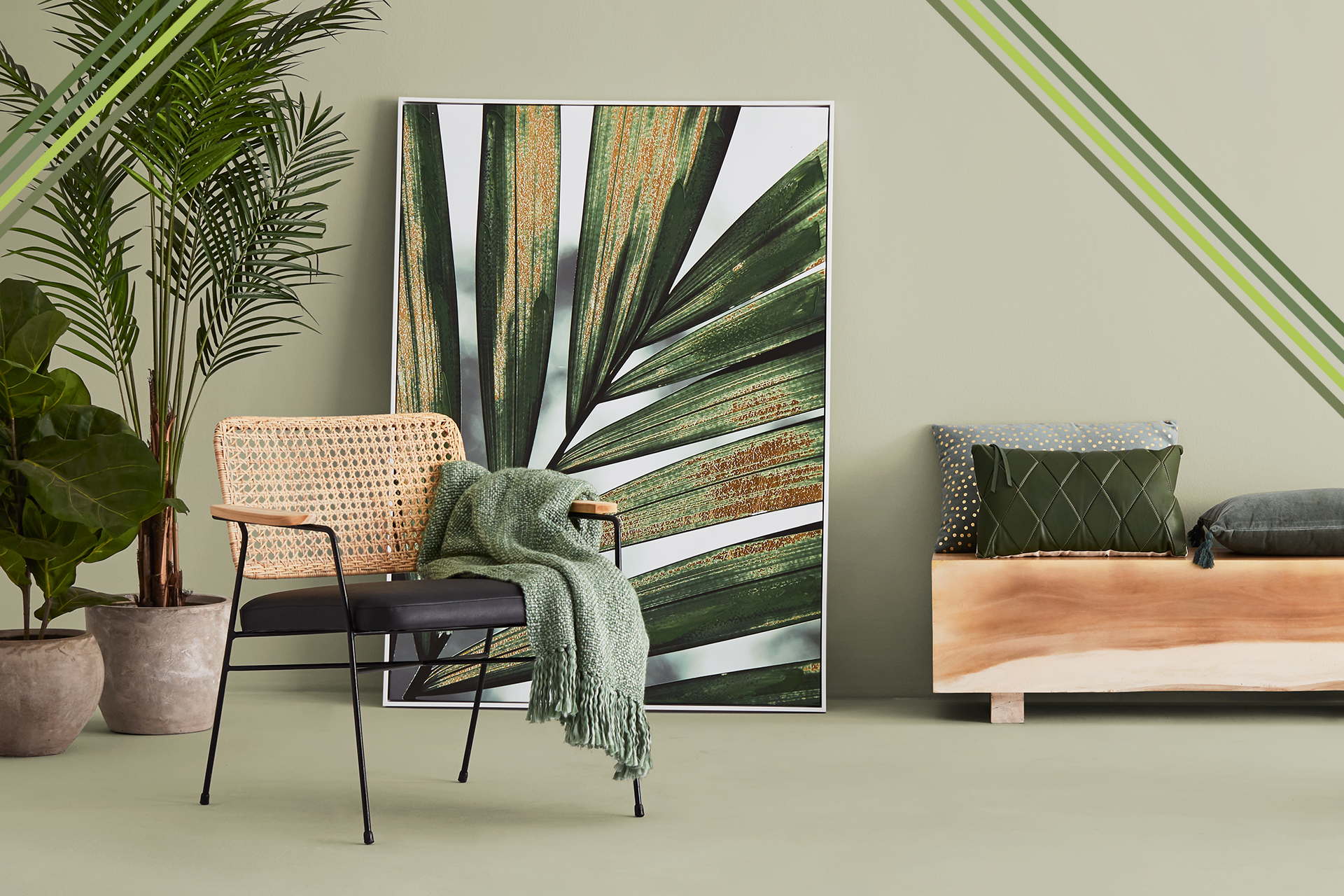
2017: Greenery

Much more than a trendy shade, Greenery positively revitalizes our interiors. Dubbed “Nature’s neutral,” it is a colour that never goes out of style. Green generally is a favourite of boho-chic décor.
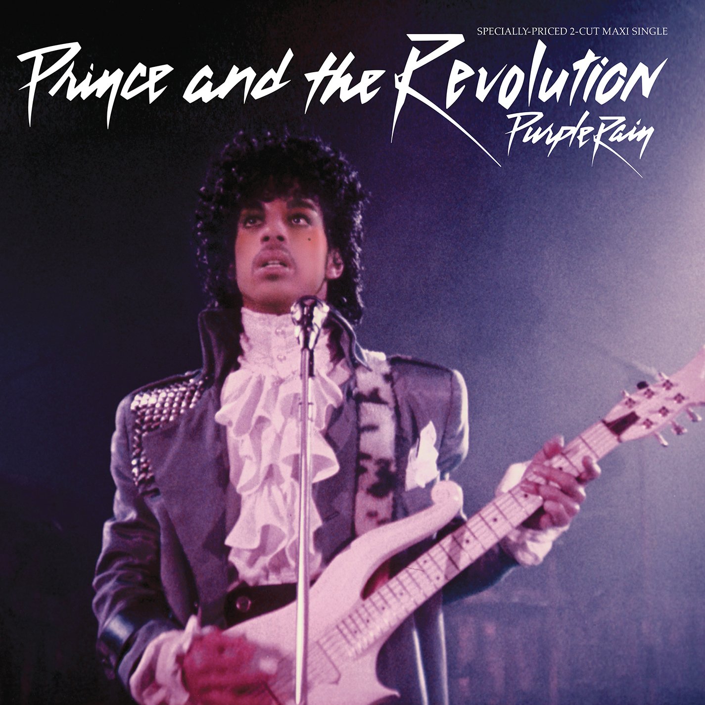
2018: Ultra Violet

Ultra Violet is an intriguing and imaginative colour. Bold and creative, it has a counter-cultural vibe associated with musical icons like Prince, David Bowie and Jimi Hendrix.
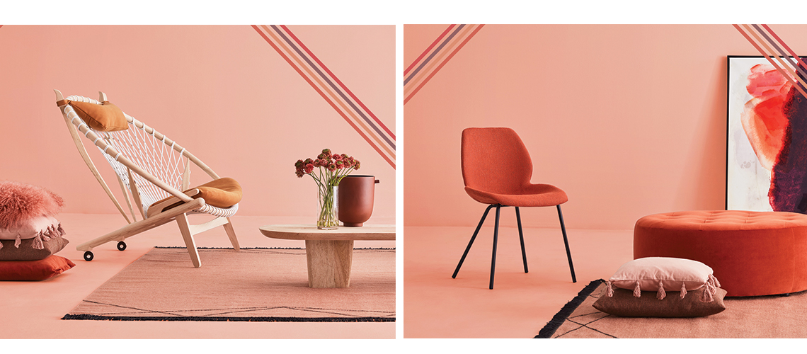
2019: Living Coral
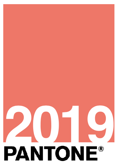
Living Coral instantly conjures up images of sunshine and vacationing down south. A vibrant, warm and energizing colour, it suffuses any interior with a spirit of optimism.
Pantone’s Color of the Year for 2020 is (drumroll please):
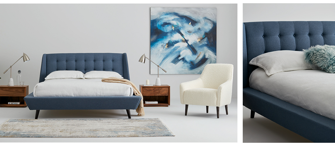
2020: Classic Blue
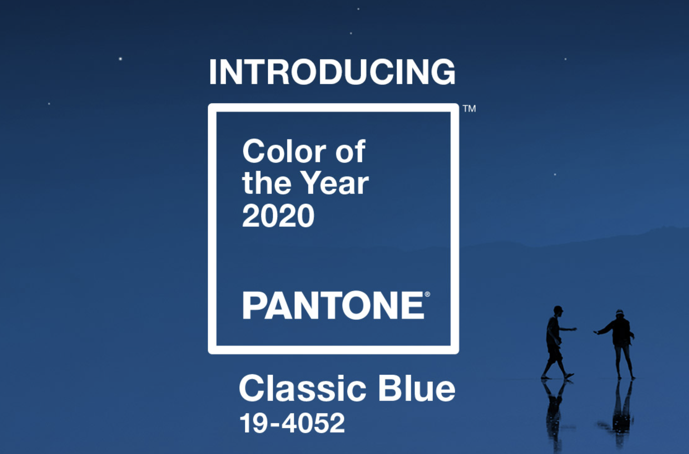
Classic Blue! This deep shade of blue is thought-provoking and reassuring. It speaks to our yearning for a stable foundation and creates a sense of refuge. It is a colour that makes time stand still, makes us think, invites us to slow down, and reminds us that the classics are here to stay.
Rooms, furniture and accessories have never been as colourful as they were in 2019, and the trend shows no signs of fading away! The possibilities are endless: choose any shade, use it as an accent colour, or in combination with one or two other colours. Be daring and have fun!

Marie-Hélène Trottier is the creative director at Montreal-based agency, Jump&Love