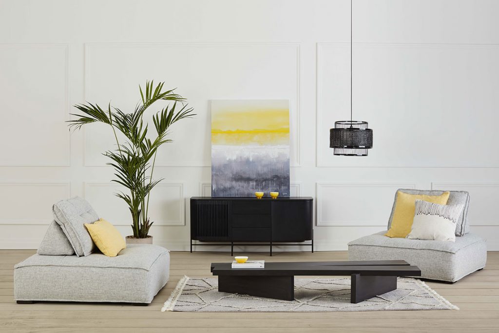
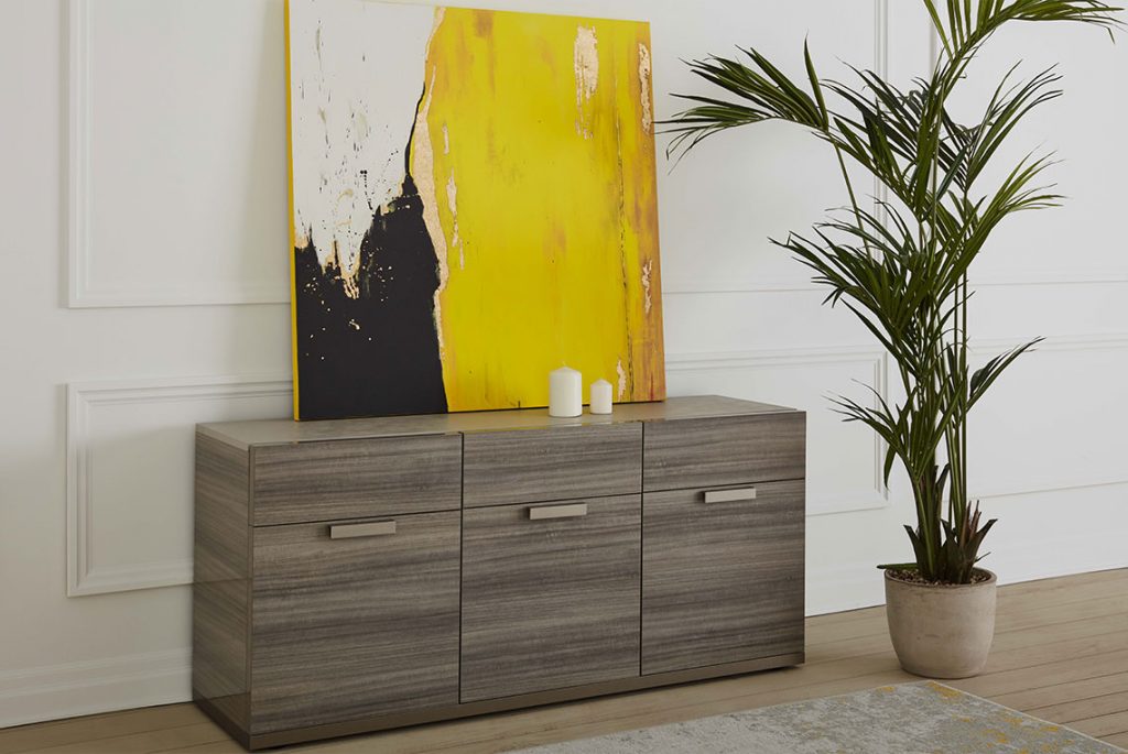
This is the second time in over 20 years that Pantone has selected two colours to guide us through a new year. Let’s not mince words: the last few months have been tough. That’s why so many people are seeking design directions that are dependable and reassuring but still add a little zing to their daily lives. So Pantone has paired the solidity of Ultimate Gray with the sparkle of Illuminating yellow to create a duo that works well together in a very natural way.
A single shade of gray
The solidity and coolness of the gray provides a foundation grounded in the present. And a good foundation makes it easier to move forward into the future. Gray also evokes raw materials such as granite, pebble beaches, and cold sea water. A timeless colour that goes with everything, gray is a pillar of design, embodying durability and stability.

If you love sunshine…
What could be a better counterpoint to gray than a clear, bold and sparkling shade of yellow? Yellow brings gray out of the shadows, allows it to shine. The cheerful glow of this yellow satisfies our innate need to be seen and heard and acts as a natural antidepressant. This bright golden hue heralds the return of happy days – the dawn of spring, literally and figuratively.
“Let’s go ahead and bring joy into our homes with this colour combination that is both sober and radiant.”

The Pantone tandem in action
So how do you welcome this dynamic duo into your home? Use the foundation colour for major pieces like the sofa or the rug, while dotting your décor with cheerful yellow accents, whether incorporated into the architecture itself or in the form of accessories, like a piece of art or an accent chair. If you’re feeling more adventurous, you might consider painting a wall in the yellow shade of your choice (there are plenty of options!) or select some lively tiles to give your backsplash a boost.
In the bedroom, go with gray for the bed frame, but let the sun shine in with yellow cushions, drapes or bedding.
The idea is to have fun with this duo, let your imagination run wild and try any combination that strikes your fancy, from the most understated to the most daring. While the last year was difficult, we are finally seeing the light at the end of the tunnel. Let’s go ahead and bring joy into our homes with this colour combination that is both sober and radiant.
Follow our yearly Pantone colour decoding here.


