Mobilia has spotted the three leading interior design trends for summer 2019: sunset colours, ethnic influences and botanical touches, and the Scandinavian trend with its pastel hues.
THE TREND TOWARDS SUNSET COLOURS
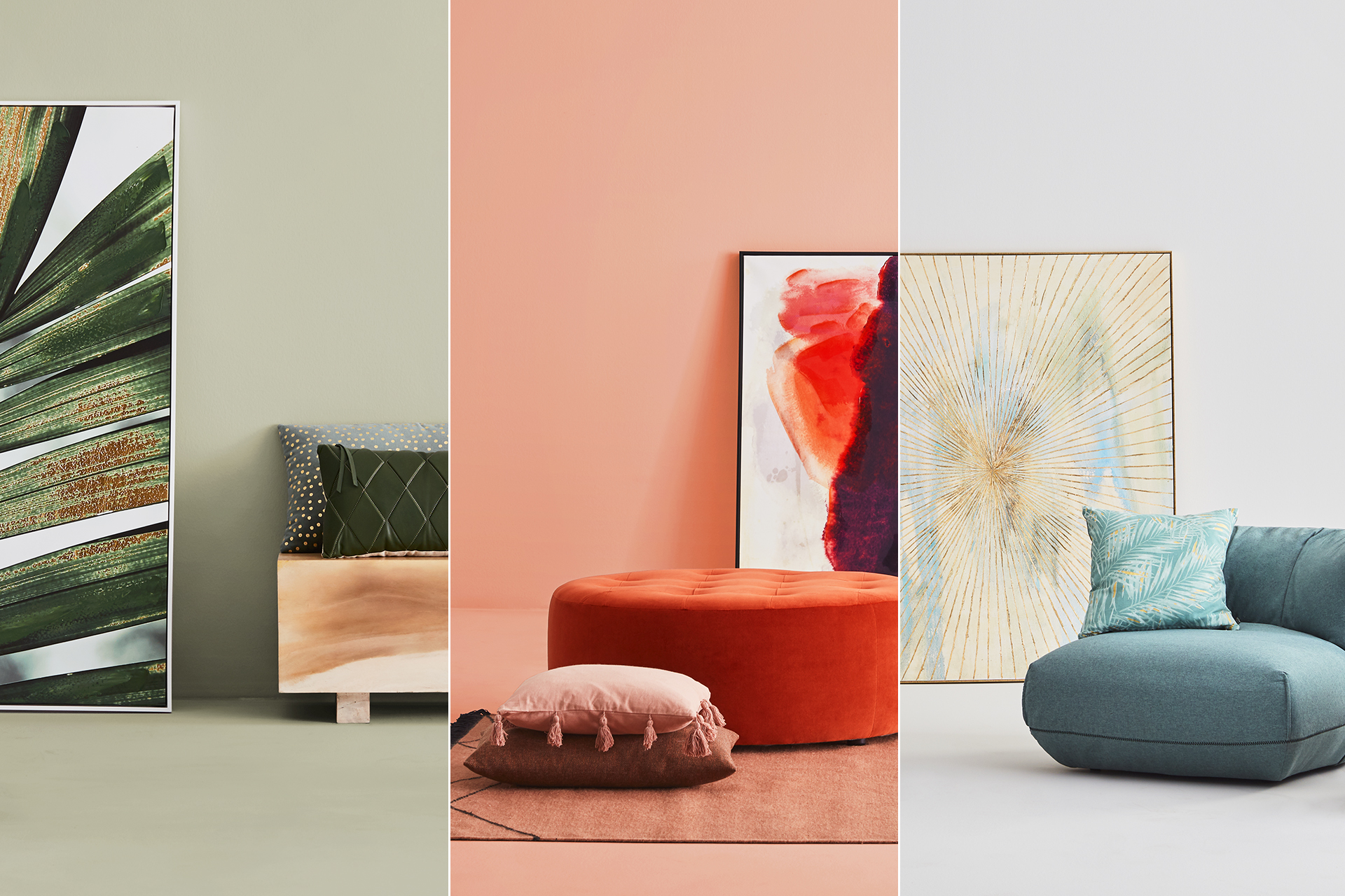
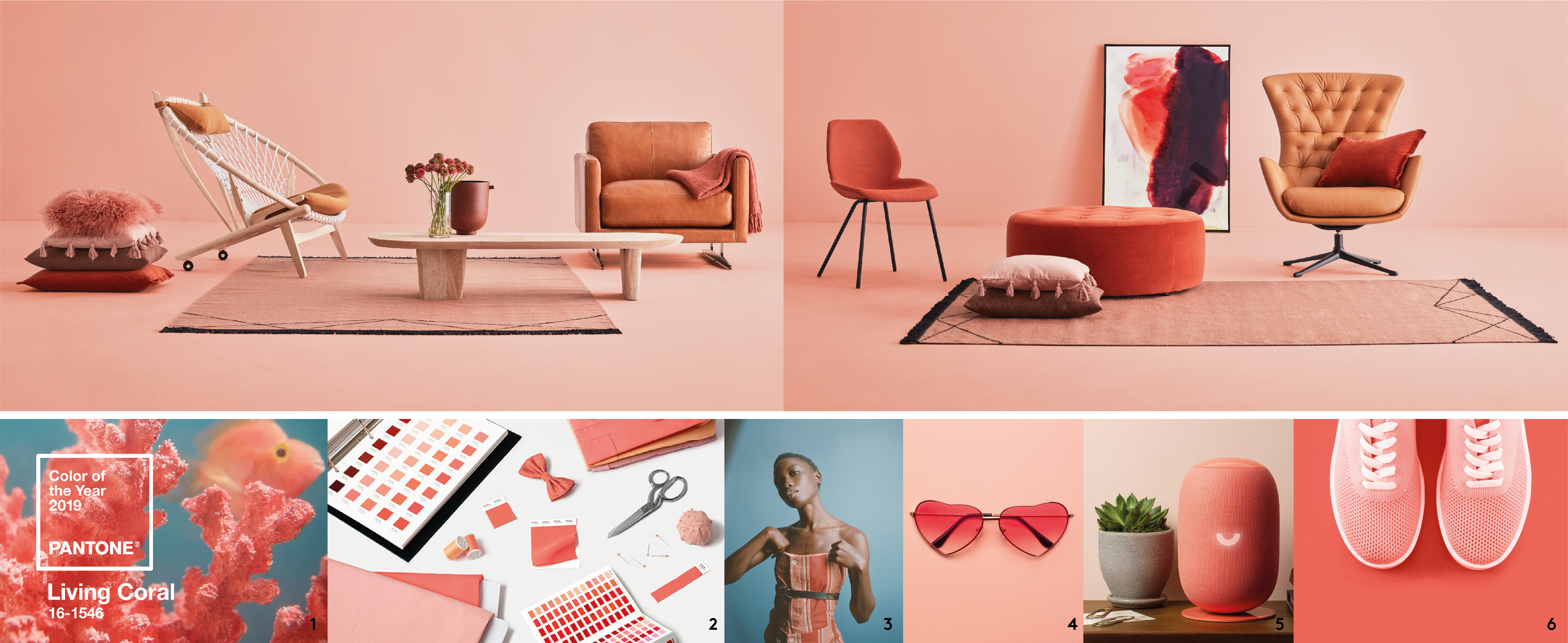
This season is aglow with the warm shades of brilliant sunsets – caramel, orange and coral – associated with positive emotions.
The 2019 Pantone colour
Every year for the last 20 years, the world’s colour experts at the Pantone Color Institute have designated a colour of the year. The announcement is always eagerly awaited by nearly 10 million designers, interior decorators, architects and merchants throughout the world. This year the celebrity colour is Living Coral, a pink-orange hue with golden undertones that immediately summons images of sunshine and vacation time. Vibrant, energizing and warm, it imparts a spirit of optimism to any décor.
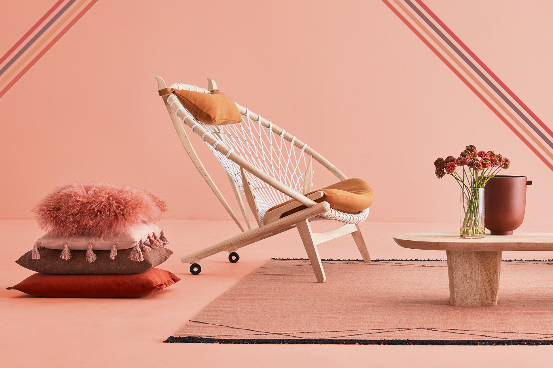
Sunset colours
This trend encompasses all the shades of a sunset. You can select a bright colour, on a ottoman, a rug or an accent chair. Just choose the shade of orange that best suits your interior! It’s the perfect colour to add warmth to chrome, pep up pale wood and add personality to your décor.
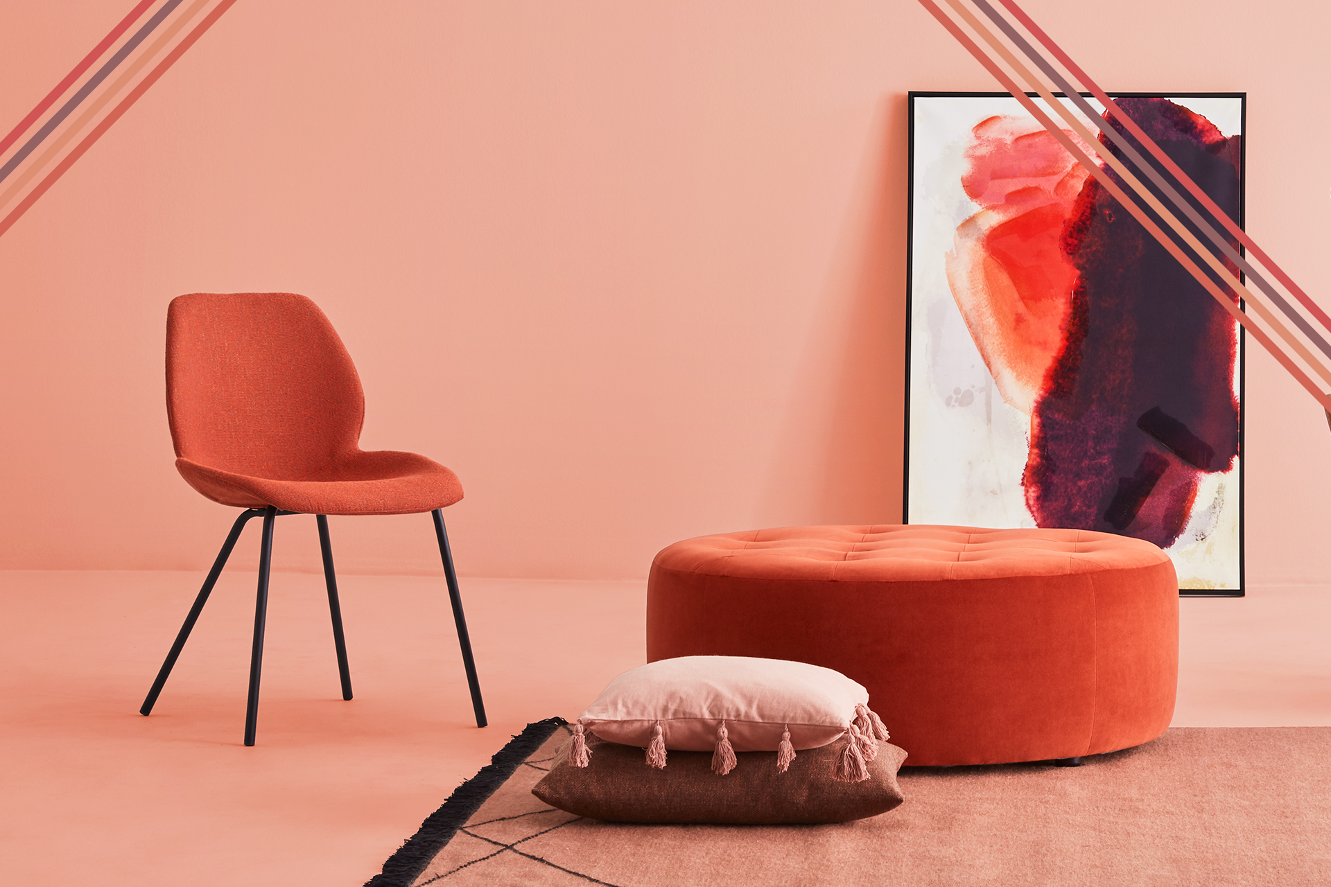
Terracotta
Last year, terracotta emerged as a sought-after decorative accessory and its success continued in 2019. This colour pairs beautifully with the trend towards green plants, terracotta pots and hanging planters.
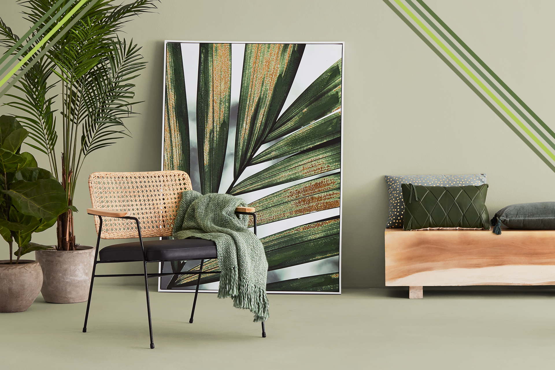
THE ETHNIC INFLUENCES & BOTANICAL TOUCHES
Think green! The colour, that is. And combine it with plants, natural materials and geometric motifs. This trend lends a boho-chic touch to any interior and will have you dreaming of far-off places.
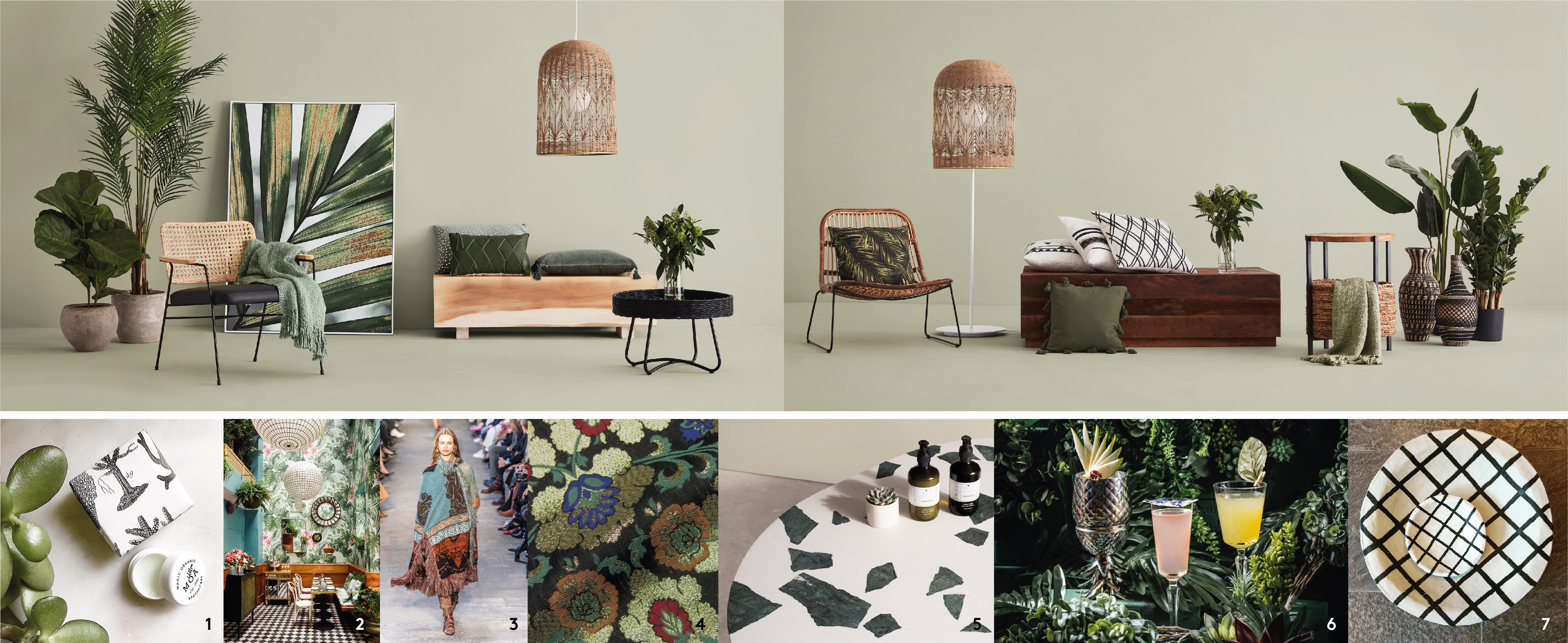
Shades of green inspired by nature
For some years now, pastel shades of green like grey-green, moss green and celadon green have been among the must-haves in interior design palettes. This year, the go-to colour for interiors is sage green: it’s green, but not too green. Warm and natural, sage green creates a soft and elegant look. Evocative of cacti and succulents, sage green is the perfect choice of colour to bring out the beauty of indoor plants.
Currents and counter-currents
They say every current gives rise to a counter-current. That’s so true in today’s world, where technology floods our environments with white light and neon colours. As a counter-current, consider the boho-chic trend; it creates a comforting ambiance with natural materials like wood, bamboo and rattan. You can really get creative with this trend, mixing contemporary furniture with personal objects, souvenirs, ethnic-inflected accessories such as cushions or vases – all objects that impart a casual vibe.
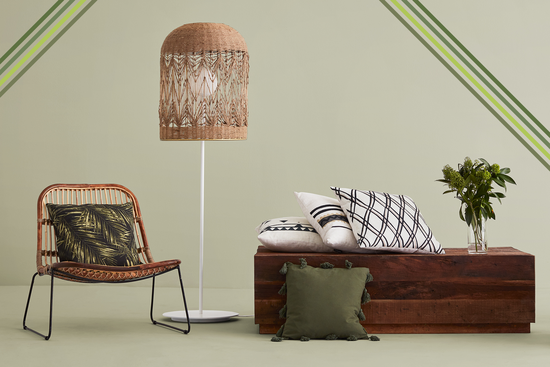
Artificial plants
Don’t have a green thumb but want to add a touch of life to your interior or exterior décor? Check out the sublime collection of artificial plants in our World More Natural. Small plants can sit on a coffee table, while bigger ones can divide the space. This trend can also take the form of a motif or some cushions.
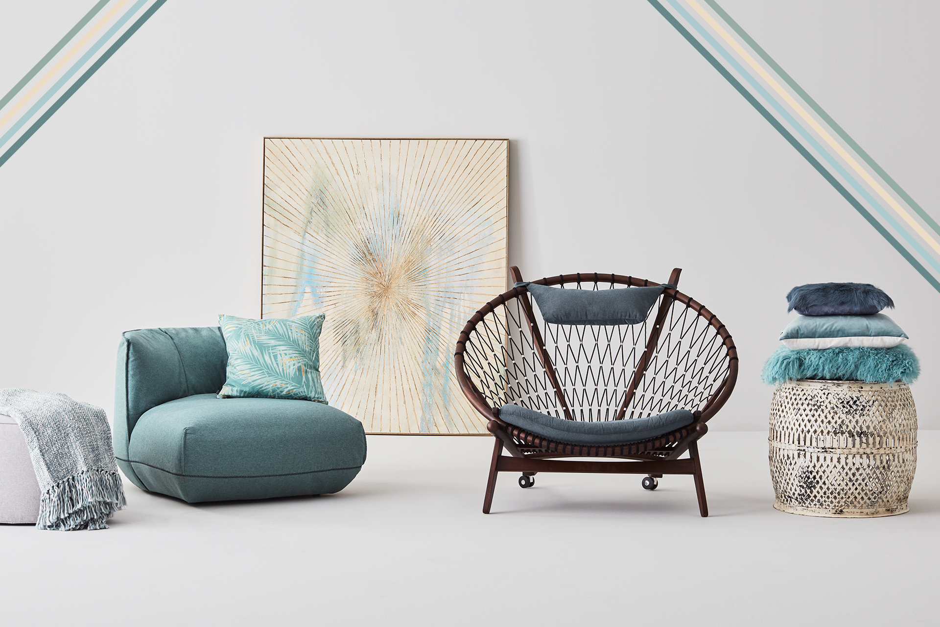
THE HYGGE AND PASTEL TREND
Nothing works better than soft materials and delicate colours to create a comforting atmosphere – think of soothing tones like dusty rose and blue-grey.
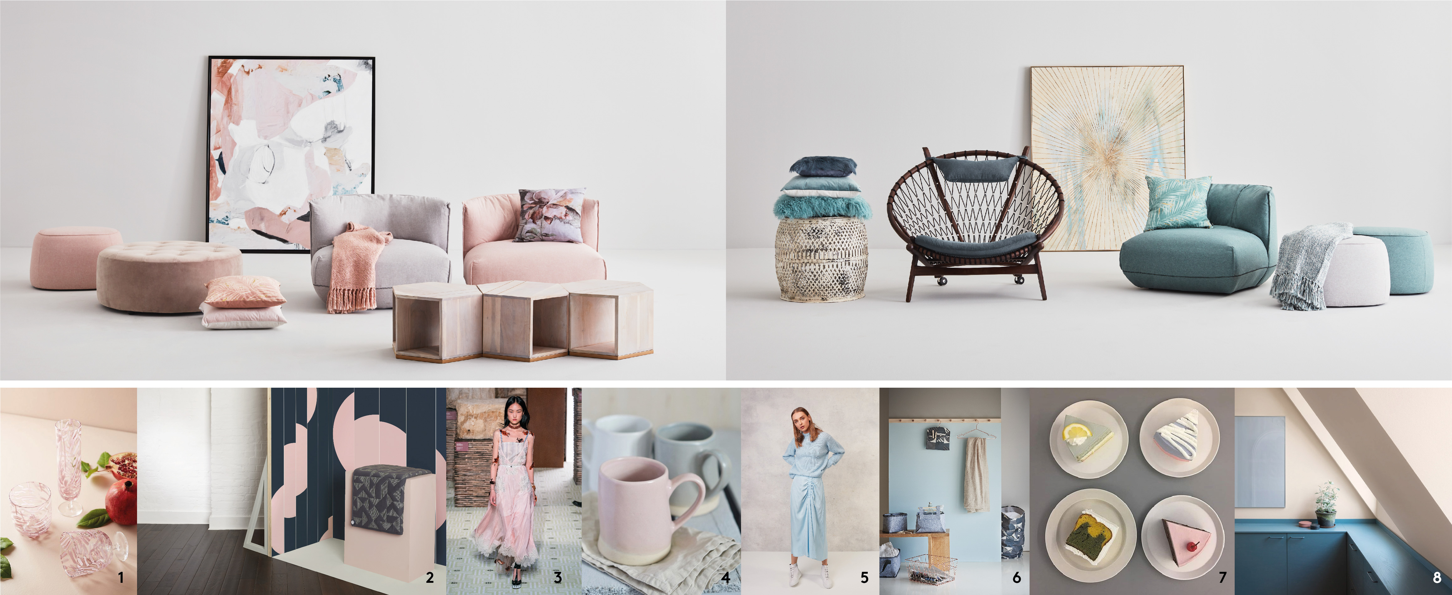
Hygge
Hygge is the Scandinavian art of living. The word evokes a sense of well-being and a warm and positive atmosphere. There’s nothing like pastel colours, rounded shapes and pure lines to help you create this mood in your home. The Sylka accent chairs and ottomans exemplify this cheerful, curvy minimalist design trend. In 2019, tables, sofas, accent chairs and console tables will all have a more fluid and organic style in keeping with the emphasis on comfort and nature.
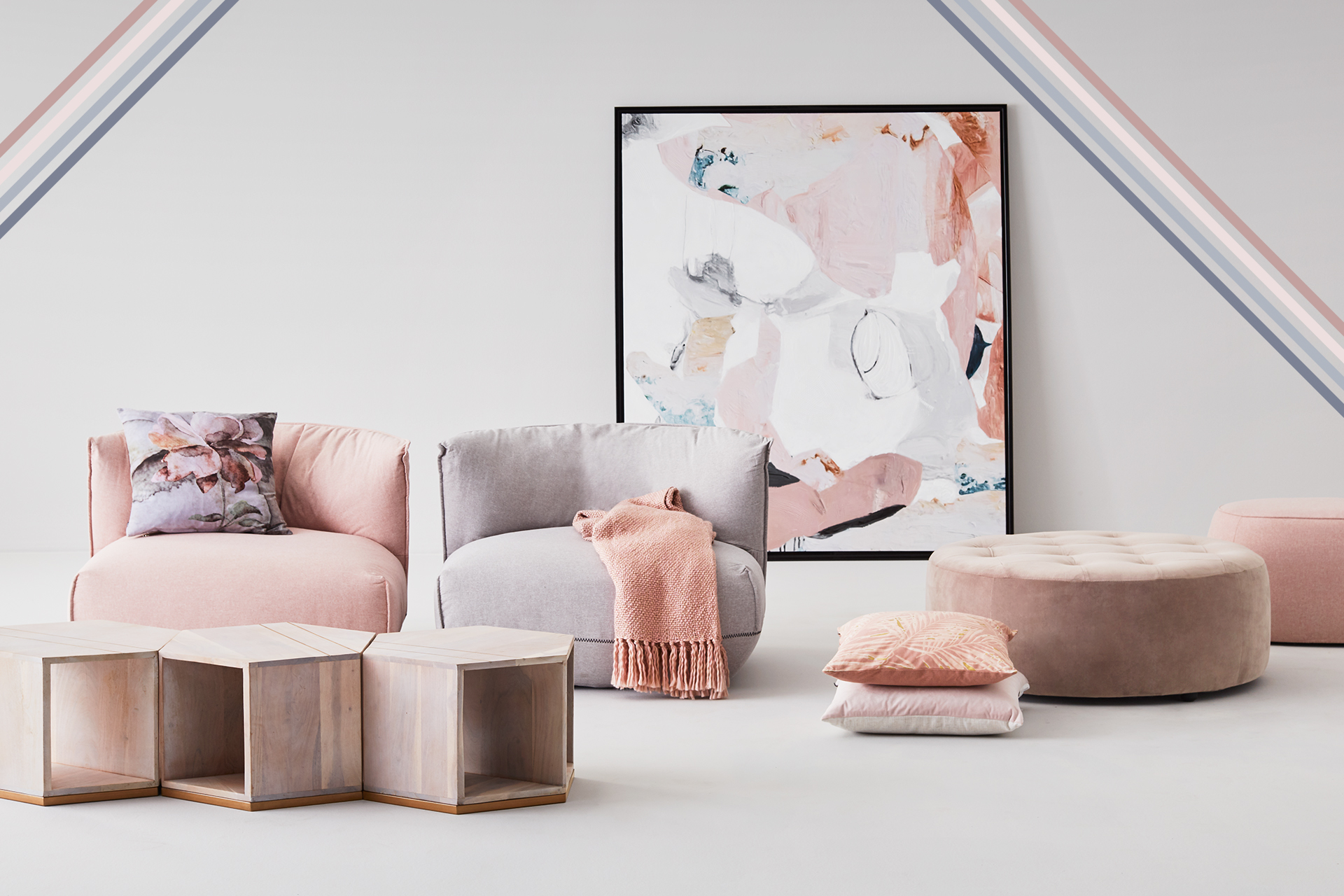
Pastel colours
Dusty rose and blue-grey are iconic colours in the Scandinavian palette that create an atmosphere conducive to relaxing and enjoying the moment. These colours add a note of Nordic freshness, especially paired with white or pale grey and wood furniture. The rose colour shades off into tones approaching peach, beige and lilac, while the blue encompasses more markedly contrasting tones. Dusty rose and blue-grey are well on their way to being crowned the new neutrals.