We’re the first to admit that Pantone caught us a little off-guard by naming Very Peri their colour of the year. In fact, it’s the first time the Pantone Color Institute created a hue specifically for the year.
Purple? Mauve? Lilac?
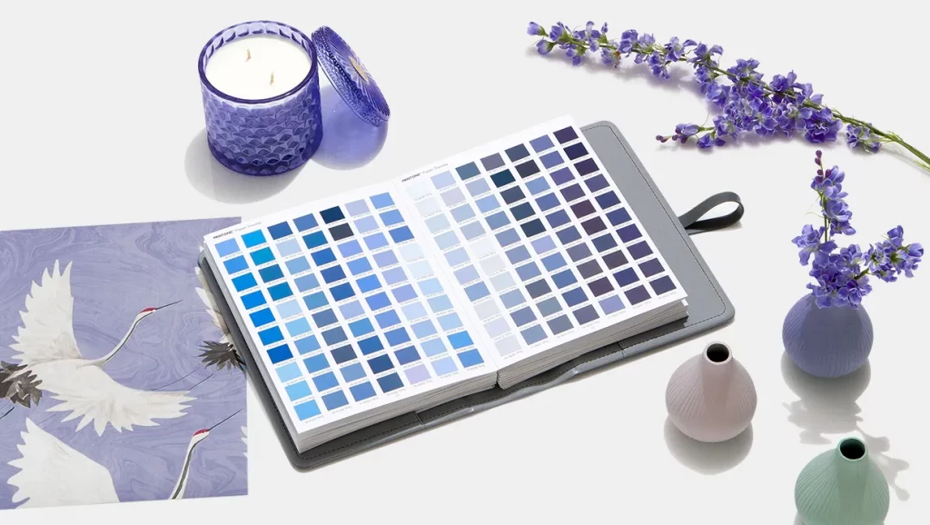
A per-plexing decision? Allow us to explain. The name Very Peri comes from “periwinkle,” as in the flower. It’s a tricky colour to describe, so for the purposes of this article, let’s call it slightly blue and purple. It lands squarely in the middle of the two but has a greyish undertone as well. If Very Peri looks familiar, it’s because this colour has been popping up on runways and fashion blogs in recent months. So given that it’s also Pantone’s choice, you can expect to see it gain in popularity and become more prevalent.
Soft focus
Although Very Peri is named after a plant, we can’t help but feel that its energy is a little more spacey and cosmic than it is floral, excited about the possibilities of a new year (at least we hope). This is an unexpected but bold choice, sure to infuse confidence and positivity for all who wear it.
Very Peri in the home
While we’re elated for the fashionistas among us, let’s face it: Very Peri doesn’t seem to be the easiest colour to use for decorating. However, its presence can pay off in a big way as the soothing shade creates a cozy, encompassing space. Its softer side makes it a sublime choice for the bathroom or bedroom. Those reluctant to commit fully can leverage its boldness in small doses.
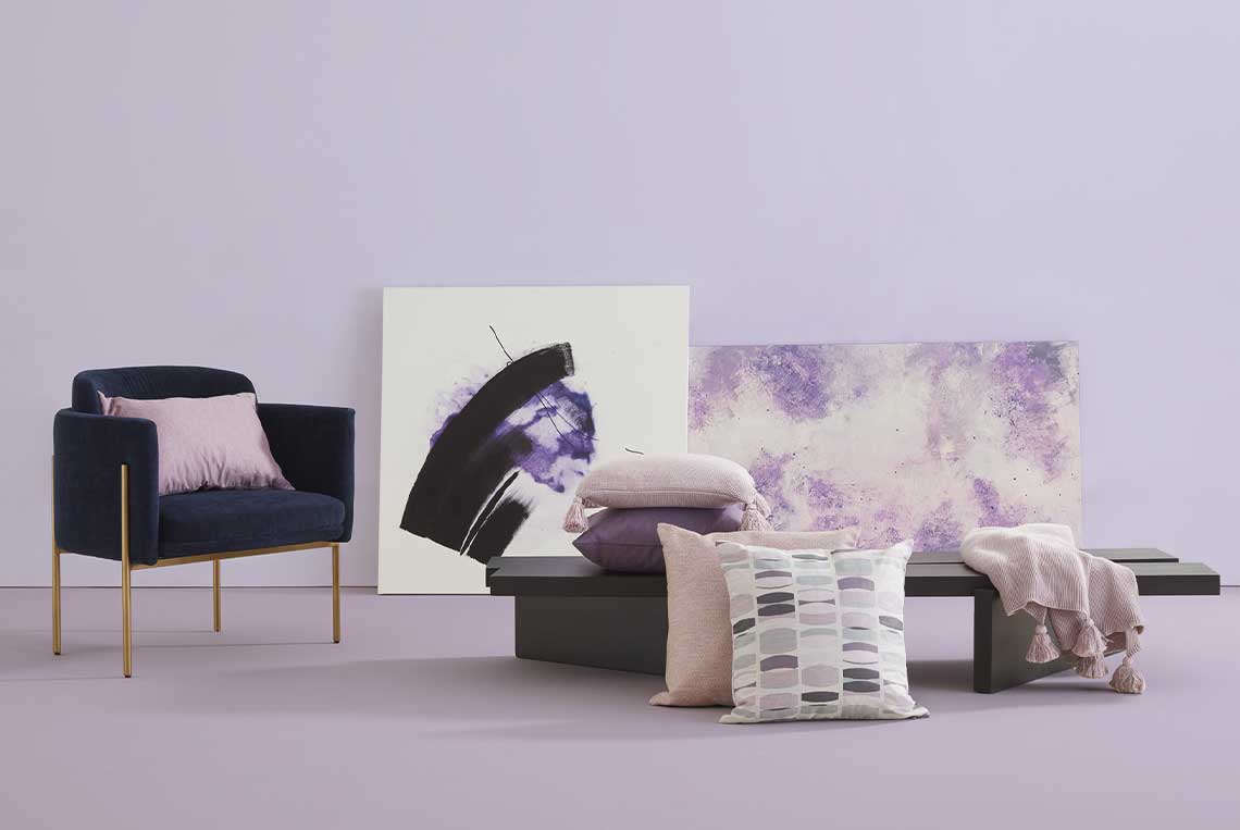
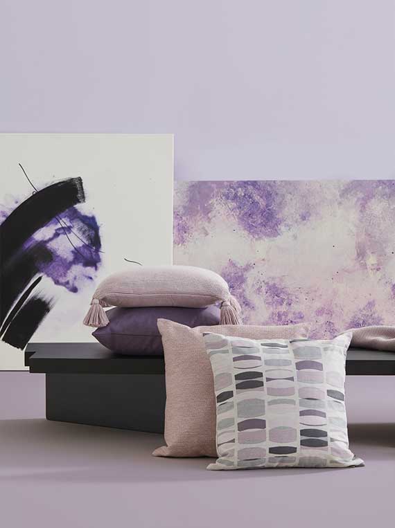
Very Peri is inviting yet introspective, filled with depth and emotion.

Colourful accents
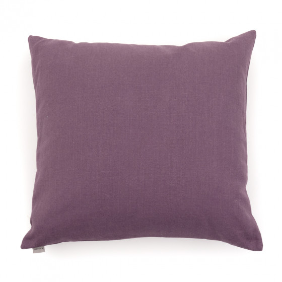
This soft purple pairs well with navy, beiges, pinks, even golds. When correctly colour-matched, you’ll find it gives rooms with vibrancy and calmness. Use it sparingly, like on cushions or a throw pillow to give your sofa or to seat a pop of colour.
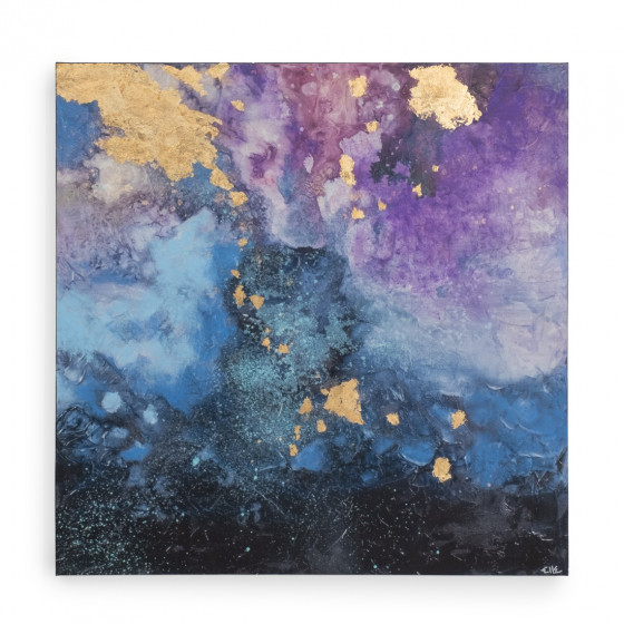
Or, adorn your walls with Very Peri-inspired artwork. Yes, the colour of the year can work for any room in the house but requires a little more imagination on your part than a standard neutral might. Need more reasons to incorporate this colour into your home? Here are some: it’s said to spark creativity—or at least so says Laurie Pressman, Vice President of the Pantone Color Institute. So, get ready to stimulate your imagination by welcoming Very Peri home.
The colour of the year is as soft as it is outgoing. It’s complex and reflects our current moment, one of transition and transformation. Very Peri is inviting yet introspective, filled with depth and emotion. In a way, Very Peri encourages us to reconnect with ourselves.